Showing posts with label logo design yorkville. Show all posts

Wednesday, March 2, 2011

Spartan Story

To celebrate the grand opening of the Michigan State University Medical School campus in downtown Grand Rapids MI, advertising agency Extra Credit Projects developed a print and outdoor campaign that’s turning heads. Featuring the familiar Spartan football helmet, the ads are intended to inform the public about the new location as well as enhance the brand in the region. “It’s a really big deal for the city to be able to officially be a part of the Big Ten,” said agency principal Rob Jackson.

Tasha Lee Design, Chicagoland Graphic Designer
Email Me: tasha@tashaleedesign.com

Monday, December 13, 2010

Making Art Out of Everyday Items.

After seeing some of these everyday products offered in other countries.....
I vote that America is visually boring!

mailbox with a porthole {Radius}

humidifier {Plusminuszero }

remote control stand {Eau}

magazine rack {fumfum}

space heater {Plusminuszero}

umbrella stand {Elic}


Tasha Lee Design, Chicagoland Graphic Designer
Email Me: tasha@tashaleedesign.com

Wednesday, September 8, 2010

The U.S. Postal Service Is Dying. Why Not Radically Rebrand It?

Could a new identity save the United States Postal Service? The idea is not so far–fetched: The postal services in Belgium and other countries have taken on rebrands that better reflect their new capabilities as they compete against commercial shopping competitors.

And is retro the way to go?

Snail mail use keeps dropping, and now the U.S. Postal Service wants to save a bunch of cash by slashing Saturday delivery. Will a new look help rescue the agency? D.C. designer Matt Chase has a wacky proposal: Rebrand the USPS to evoke the very anachronisms that are costing it billions.

read more

Tuesday, August 10, 2010

Illustrating The World Cup

The South African illustration house, Am I Collective, scored a creative coup when it was commissioned to create 32 murals for ESPN's 2010 FIFA World Cup campaign via Wieden+Kennedy. The 32 murals celebrate each of the 32 teams that will be competing in the 2010 FIFA World Cup. ESPN owns the broadcasting rights to the event in a number of territories including the USA. See them all in one place at... 9 Gag

www.tashaleedesign.com • tasha@tashaleedesign.com
Romania untangles logo path

Despite the fact that its new tourism logo is under a possible infringement charge and it has not yet paid the designer for the logo, Romania will continue to use its new mark as the controversy reigns.

The design contains a leaf that bears a striking resemblance to a logo that is currently for sale on the internet that was originally created for a transport company. The company that created the new Romania logo has offered to share all of its onĂ¢€“paper drawings and intermediary designs and has even offered to produce supplementary design work on the project. Discussions continue.

SOURCE: Romainia Insider


Family Dollar revamps brand


As the budget continues to be depressed, more and more people shop at "dollar" stores. Capitalizing on that trend, Family Dollar has hired the ad agency Bernstein–Rein and has released a new logo to help freshen its identity and create a presence that further lessens the stigma of shopping at a dollar–type store.

Family Dollar, which operates about 6,700 stores, is also using social media like Facebook and is even texting customers with news special prices.

SOURCE: wfae.org


www.tashaleedesign.com • tasha@tashaleedesign.com

Tuesday, August 3, 2010


NEW CHEVROLET BRAND

Chevrolet has introduced a new mini–car brand, Baojun, to China. Baojun is the Chinese word for "treasured horse."

SOURCE: Logo Lounge


WHY THE Y MADE THE SWITCH

Catching up on the public's common parlance of many years, the YMCA has ma

de the formal brand change to the Y. From the organization’s web site:

"This new brand announcement represents a transition in the correct way to refer to the Y in writing. "The Y" should be used whenever referring to the collective organization. "The" should be lowercase unless it is used at the beginning of a sentence. YMCA should be used when referring to a specific location, i.e., "The YMCA of Greater Louisville."

With this switch comes a new logo—part arrow, part letter, part icon—and a bright color scheme, all courtesy of Siegel+Gale. It's the sixth logo since the group’s inception, and its first revise since 1967. The new design is grounded in the Y's (yes, it's a bit odd) new trifold focus on youth development, healthy living, and social responsibility.

SOURCE: ymca.net

HISTORY OF THE Y'S LOGO


www.tashaleedesign.com • tasha@tashaleedesign.com

Monday, July 26, 2010

CBX Refashions Tampon Packaging

Black packaging accented with bright colors presents new look for U by Kotex, a brand of feminine products that recently hit store shelves. With CBX at the design helm, tge product line, which includes tampons, liners and pads for 14-22 year olds, banishes staid floral patterns and pastel hues. "The black package is attention-grabbing on the shelf, yet discreet when sitting in the shopping cart, purse or home," says Rick Barrack, Chief Creative Officer at CBX. The letter "U" stands out on the box, he says, as an icon for the brand. "Contemporary, straightforward, clean fonts are used to call out brand, product type and form," Barrack continues. He says CBX drastically altered the visual landscape of the feminine health aisle by "creating a graphic vocabulary for U by Kotex that leverages color palettes and abstract patterns from the fashion world.

SOURCE: GD USA

www.tashaleedesign.com • tasha@tashaleedesign.com

Friday, July 16, 2010

Protect Your Health

Try to find health insurance. I know that, depending on where you live, health insurance might be hard to find. Freelancers are notorious for not having health coverage. But, if you don’t have adequate coverage, you’re more likely to avoid getting the treatment that you really need when you’re sick.

Get enough rest. It’s important to schedule regular breaks and time off. While working lots of hours may seem like a really good idea at first and may even lead to more income at first, no one can sustain a crazy pace forever. Eventually all of those extra hours will lead to stress, burnout, or illness.

Eat properly. Business Owners often take trips to the local coffee shop to provide them with a change of pace, meet a client, etc. While getting out and about from time to time is a good idea, unfortunately the fare found at your local coffee shop is not always the healthiest. If this is a problem for you, try to identify a few healthy food choices at your coffee shop and stick to those.

Engage in exercise. Most business owners work on the computer to provide some sort of service to their clients. This means that most of us are fairly sedentary. Unless we make a special effort, we won’t get any exercise. Unfortunately, studies have shown that a sedentary lifestyle is not healthy, so make that effort to get enough exercise.

Take steps to manage your stress. Owning your own business can be stressful, and continued stress can leave you feeling run down and make you more susceptible to illnesses. Take the time to identify what causes stress for you. Find ways to reduce your stressors.

SOURCE: Freelance Folder

www.tashaleedesign.com • tasha@tashaleedesign.com

Starbucks BYOC

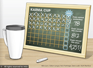
Bring your own cup. This concept was the big winner of a competition sponsored by Starbucks to gather ideas for reducing non-recyclable paper cup. The idea, using an in store chalkboard, would encourage customers to bring their own cups for possible free drinks. The three honorable mentions are also ideas that encourage customer reuse, but one did includes a rice-based reusable cup, and the five "community picks" are a mix of biodegradable, recyclable and collapsible cups.

www.tashaleedesign.com • tasha@tashaleedesign.com

Thursday, July 15, 2010

UPS Green Label

Companies that meet UPS standards can now ship their goods with a label that attests to their "greenness." Called the Eco Responsible Packaging Program, UPS evaluates a customer's shipment packaging processes on three levels — damage prevention, right-sizing, and packaging materials — and authorizes the UPS logo use when approved. The company uses the Sustainable Packaging Coalition Compass software in its new program to evaluate the life cycle impacts of package design.

www.tashaleedesign.com • tasha@tashaleedesign.com

Saturday, July 10, 2010

Mapquest Seeks New Logo

Wolff Olins has developed a new logo and identity for MapQuest. It's clean and modern and was designed to take the emphasis off of simple online mapping. Instead, the new identity is meant to stress the service as an integral part of your life.

People see different things in the new logo—a little animal, map–to–the–power–of –your–quest, or simply a much–needed modern revamp. The purple and bright green mark is just part of the revamp: The site itself is more user–friendly and certainly more flexible.

new.mapquest.com

SOURCE: Logo Lounge


www.tashaleedesign.com • tasha@tashaleedesign.com

Friday, July 2, 2010

PUMA thinks out of the {shoe}box


PUMA has unveiled the next step in its long-term sustainability program, introducing a sustainable packaging and distribution system by renowned industrial designer Yves Behar. Behar, of San Francisco based fuseproject, designed a "Clever Little Bag" to replace the ever present cardboard shoebox with a reusable shoe bag that protects each pair from damage. As a result of the 65% paper reduction though the "Clever Little Bag" concept, PUMA claims it will cut water, energy and diesel consumption on the manufacturing level by more than 60% a year.

SOURCE: www.fuseproject.com


www.tashaleedesign.com • tasha@tashaleedesign.com

Monday, June 28, 2010

3 Proposal Follow-up Tips

Before you submit a proposal, you’re in an ongoing dialog with your prospects, e-mailing back and forth. Then, with some, as soon as you submit the proposal, silence reigns and you never hear from them again. That’s the “black hole.” If this happens to you, know that you’re not alone.

People are so busy these days that they rarely take the time to let you know what happened. It’s discourteous and unprofessional, but it’s becoming the norm. Whether there was a shift in their priorities or they awarded the project to someone else, you may never find out. Sometimes you have to accept that fact.

However, don’t disappear into that black hole yourself. Stay in the game. Here are three ways to do that:

1. Leave a final message. If it’s clear that the project isn’t going to happen within the time frame you’d anticipated, don’t just slink away. Put some closure to the process by leaving a final voice mail message along these lines: “I haven’t heard from you, so I don’t know what happened with the proposal we sent, but it looks like it’s not going to happen within the time frame we discussed. So I just wanted to let you know that we’re still interested in pursuing this if and when you are. I will touch base again in a month.” Then send that same message via e-mail, so they have it in writing (and because they just may respond to it).

2. Check in to see how it’s going.
This is especially important if they did award the project to someone else. Let some time go by, then call to see how it’s going. They may have chosen the low bidder and are paying for it now with low-quality work. If you happen to call and things aren’t going well, you might be the perfect solution to their problems.

3. Stay in touch. Obviously, you shouldn’t stalk your prospects, but you also mustn’t drop out of sight. Let your marketing kick in by staying in touch via an e-mail newsletter or regular postcard mailings to stay top of mind.

SOURCE: HOW Design

www.tashaleedesign.com • tasha@tashaleedesign.com

Tuesday, May 18, 2010

The merger of United Airlines with Continental has many ramifications. One of them is that the company will kill the "U’ logo designed by the legendary Saul Bass. It is expected that, though the name will be United, the graphics will be based on Continental’s typography and symbol.

www.tashaleedesign.com • tasha@tashaleedesign.com

Thursday, May 6, 2010

Aligning The Pyramids

The popularity of specialty tea is on the rise, expected to reach $15 billion in sales by 2012, due to its purported health benefits of tea drinking. To align Lipton with upscale, gourmet tea products, Moxie™, re-energized the packaging for the line of premium pyramid tea bags. Vibrant colors, photography rather than illustrations, and flavor imagery help fulfill the tea’s promise, says Moxie™ head Tammy Vaserstein. The design team retained Lipton’s familiar red brandmark and signature color of premium yellow, which was lightened to a champagne-like hue, alluding to a heightened sense of elegance and quality. Lucia Varela is brand manager at Lipton.

SOURCE: GD USA

www.tashaleedesign.com • tasha@tashaleedesign.com

Tuesday, May 4, 2010

Easy Being Green

Staples, identified with the Easy Button, is in the midst of a global design contest to discover eco-friendly office products. The inaugural Staples Global EcoEasy Challenge, a partnership with the RIT, is down to seven finalists representing student teams from five universities. Three of the finalist teams are from the Indian Institute of Technology Madras (power-conserving desk chairs and shredders), from Brazil's Engineering of Piracicaba (desk and drawer organization tools made out of a local, sustainable material) while teams from Europe (better binders and pens) and Cal Berkeley (what else but a redesigned stapler.) We'll have the winner in the next GDUSA Green Enews. Staples Global EcoEasy Challenge

SOURCE: GD USA

www.tashaleedesign.com • tasha@tashaleedesign.com

Sunday, May 2, 2010

Politicians have occasionally attempted to campaign against baggy pants. Even President Obama, when a candidate, urged young black men to pull up their pants. Now New York state senator Eric Adams is putting up billboards in Brooklyn NY in an attempt to “Stop the sag” as well as a video in which he slots baggy pants into a chronology of negative racial stereotyping. Adams, a black retired police captain first elected in 2006, tapped his campaign coffers for $2,000 to put up the billboards and to make a YouTube video.

SOURCE: GD USA

www.tashaleedesign.com • tasha@tashaleedesign.com

Monday, April 26, 2010

Time Flies

To recognize its 10th anniversary, Real Simple is offering “the gift of time” to its harried readers. Inside the April issue, that means time-saving tips such as quick-cook dinners, while the cover addresses the issue conceptually. “Time is a very intangible thing — there isn't a picture of time, and there isn't a particular image that comes to mind,” says the magazine's creative director, Janet Froelich. She decided to commission clocks from industrial designers; shown here is one of the outcomes, Harry Allen's yellow clock with one hand, which reads “Past” on the top and “Future” below.

SOURCE: GD USA

www.tashaleedesign.com • tasha@tashaleedesign.com

Thursday, April 15, 2010

iStock Photo Tenth Anniversary

iStockphoto was founded in 2000, pioneering the micropayment photography business model, and has become one of the most successful user-generated content sites in the world. The company pays out more than $1.6 million weekly in artist royalties and offers millions of vetted, royalty-free photos, illustrations, video, audio and Flash files. Perhaps most important, istockphoto has reshaped the way professional graphic designers, and other art and photobuyers, work with and think about digital imagery and workflow. A microsite is dedicated to anniversary activities. Kelly Thompson, founder and now COO of istockphoto says that it is not the organization's nature to blow its own horn, but that it was important to recognize all the contributors and participants who have become part of its close-knit community. A microsite is dedicated to anniversary activities.
www.istock10.com

www.tashaleedesign.com • tasha@tashaleedesign.com

Monday, April 12, 2010

Passing with Flying Colors

Pantone's New iPhone App
Everyone from graphic designer's to industrial designers can now have access to all the PANTONE Color Libraries without carrying around bulky guides, and users can easily create harmonious color palettes by finding complementary, analogous and triadic combinations for slected colors. And not only that, colors can also be extracted from images taken by the iPhone's built in camera and matched to the closest Pantone color.

Palettes can be share with other iPhone users or emailed as color patches or application-ready swatch files for the Adobe Creative Suite, etc. Visit www.mypantone.com for more info.

SOURCE: Layers Digital Magazine

www.tashaleedesign.com • tasha@tashaleedesign.com