After seeing some of these everyday products offered in other countries.....


 remote control stand {Eau}

 umbrella stand {Elic}
Tasha Lee Design, Chicagoland Graphic Designer
Email Me: tasha@tashaleedesign.com
 remote control stand {Eau}umbrella stand {Elic}
 The South African illustration house, Am I Collective, scored a creative coup when it was commissioned to create 32 murals for ESPN's 2010 FIFA World Cup campaign via Wieden+Kennedy. The 32 murals celebrate each of the 32 teams that will be competing in the 2010 FIFA World Cup. ESPN owns the broadcasting rights to the event in a number of territories including the USA. See them all in one place at... 9 Gag
 Romania untangles logo path
Despite the fact that its new tourism logo is under a possible infringement charge and it has not yet paid the designer for the logo, Romania will continue to use its new mark as the controversy reigns.
The design contains a leaf that bears a striking resemblance to a logo that is currently for sale on the internet that was originally created for a transport company. The company that created the new Romania logo has offered to share all of its on–paper drawings and intermediary designs and has even offered to produce supplementary design work on the project. Discussions continue.
SOURCE: Romainia Insider

Family Dollar, which operates about 6,700 stores, is also using social media like Facebook and is even texting customers with news special prices.
SOURCE: wfae.org

Chevrolet has introduced a new mini–car brand, Baojun, to China. Baojun is the Chinese word for "treasured horse."
 Catching up on the public's common parlance of many years, the YMCA has ma
de the formal brand change to the Y. From the organization’s web site:
"This new brand announcement represents a transition in the correct way to refer to the Y in writing. "The Y" should be used whenever referring to the collective organization. "The" should be lowercase unless it is used at the beginning of a sentence. YMCA should be used when referring to a specific location, i.e., "The YMCA of Greater Louisville."
With this switch comes a new logo—part arrow, part letter, part icon—and a bright color scheme, all courtesy of Siegel+Gale. It's the sixth logo since the group’s inception, and its first revise since 1967. The new design is grounded in the Y's (yes, it's a bit odd) new trifold focus on youth development, healthy living, and social responsibility.
SOURCE: ymca.net

www.tashaleedesign.com • tasha@tashaleedesign.com
 Black packaging accented with bright colors presents new look for U by Kotex, a brand of feminine products that recently hit store shelves. With CBX at the design helm, tge product line, which includes tampons, liners and pads for 14-22 year olds, banishes staid floral patterns and pastel hues. "The black package is attention-grabbing on the shelf, yet discreet when sitting in the shopping cart, purse or home," says Rick Barrack, Chief Creative Officer at CBX. The letter "U" stands out on the box, he says, as an icon for the brand. "Contemporary, straightforward, clean fonts are used to call out brand, product type and form," Barrack continues. He says CBX drastically altered the visual landscape of the feminine health aisle by "creating a graphic vocabulary for U by Kotex that leverages color palettes and abstract patterns from the fashion world.
 Try to find health insurance. I know that, depending on where you live, health insurance might be hard to find. Freelancers are notorious for not having health coverage. But, if you don’t have adequate coverage, you’re more likely to avoid getting the treatment that you really need when you’re sick.
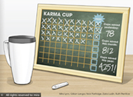 Bring your own cup. This concept was the big winner of a competition sponsored by Starbucks to gather ideas for reducing non-recyclable paper cup. The idea, using an in store chalkboard, would encourage customers to bring their own cups for possible free drinks. The three honorable mentions are also ideas that encourage customer reuse, but one did includes a rice-based reusable cup, and the five "community picks" are a mix of biodegradable, recyclable and collapsible cups.
 The Brazilian President Lula, upon unveiling 2014 World Cup Logo, stated that the games will be dedicated to the environment: "We will make a green World Cup, green as our forests. Environmental sustainability will be a trademark of Brazil and the next World Cup. We want to leave a legacy to improve the quality of life of our people. We are sure that we will charm the world, like South Africa charmed us this year."
 Companies that meet UPS standards can now ship their goods with a label that attests to their "greenness." Called the Eco Responsible Packaging Program, UPS evaluates a customer's shipment packaging processes on three levels — damage prevention, right-sizing, and packaging materials — and authorizes the UPS logo use when approved. The company uses the Sustainable Packaging Coalition Compass software in its new program to evaluate the life cycle impacts of package design.
 Wolff Olins has developed a new logo and identity for MapQuest. It's clean and modern and was designed to take the emphasis off of simple online mapping. Instead, the new identity is meant to stress the service as an integral part of your life.
 People see different things in the new logo—a little animal, map–to–the–power–of –your–quest, or simply a much–needed modern revamp. The purple and bright green mark is just part of the revamp: The site itself is more user–friendly and certainly more flexible.
SOURCE: Logo Lounge


 Before you submit a proposal, you’re in an ongoing dialog with your prospects, e-mailing back and forth. Then, with some, as soon as you submit the proposal, silence reigns and you never hear from them again. That’s the “black hole.” If this happens to you, know that you’re not alone.
 TCBY has revealed its new logo, which will replace its original 30–year–old design.
 There are various versions of the new logo in the rumor mills at present, and photos of the prototype store, to be opened in Salt Lake City, do not show the same logo as what is reported to be released. In any case, the new identity is sleeker and simpler.
If the new store design, created by Salt Lake City-based StruckAxiom, proves successful in two corporate-owned prototype stores, it will be offered to franchisers.
SOURCE: QSR Magazine